Feeling the winter blues? The right shade of red can warm up your space and boost your mood!
Winter often brings a craving for warmth, and few colors deliver cozy energy and bold vibrance quite like red. But not all reds are created equal—some bring rich elegance, while others create fiery energy.
That’s why we’re ranking the best reds for winter from cozy to powerfully energizing, helping you find the perfect red to enhance your space and influence your mood. Let’s dive into the Winter Reds Tier List and discover which red best suits your style!
Winter Reds: Choosing the Best Red for Your Space & Mood
Introduction
As winter sets in, many of us instinctively seek warmth, comfort, and vibrancy in our surroundings. One of the most powerful ways to infuse energy and coziness into a space is through color psychology—and few colors embody warmth and vitality as well as red. However, not all reds evoke the same feeling. Some create a sense of grounded stability, while others ignite bold energy and passion.
That’s why we’re breaking down the Winter Reds Tier List, ranking the best red hues for interior design based on their mood, aesthetic appeal, and ideal use in a space. Whether you’re looking for a cozy rustic red or a vibrant statement shade, this guide will help you select the perfect winter red for your style.
The Psychology of Red: Why It Matters in Interior Design
Red is a power color, often associated with passion, warmth, and confidence. It has the ability to stimulate energy, enhance focus, and evoke strong emotions—making it a bold yet strategic choice for interior design.
However, different shades of red can have vastly different effects. While a deep burgundy might exude sophistication and timeless elegance, a bright scarlet red can energize a space and create a high-impact statement. Understanding these variations helps ensure that your red enhances rather than overwhelms your space.
The Winter Reds Tier List
We’ve ranked four distinct shades of red, each bringing its own personality and energy to an interior.
You May Like: Get in Touch with Your Inner Hue: The Ayurvedic Approach to Color Therapy
S-Tier: High-Impact, Statement Reds
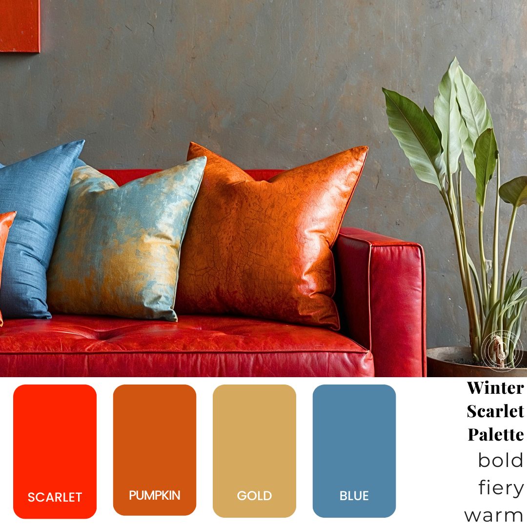
Scarlet Red – The Bold & Fiery Showstopper
- Best for: Statement walls, bold furniture, dining rooms
- Pairs well with: Pumpkin orange, gold, deep blue
- Mood: Passionate, invigorating, full of life
Scarlet Red is bold, dynamic, and full of energy, making it the perfect antidote to the winter blues. It commands attention, making it an ideal choice for social spaces like dining areas or creative environments where inspiration is key. If you want a red that stimulates conversation and excitement, Scarlet is a top-tier choice.
Design Tip: Pair Scarlet with gold accents for a luxurious feel, deep blue for contrast, and pumpkin orange for a warm, harmonious palette.
A-Tier: Bright, Playful, & Uplifting Reds
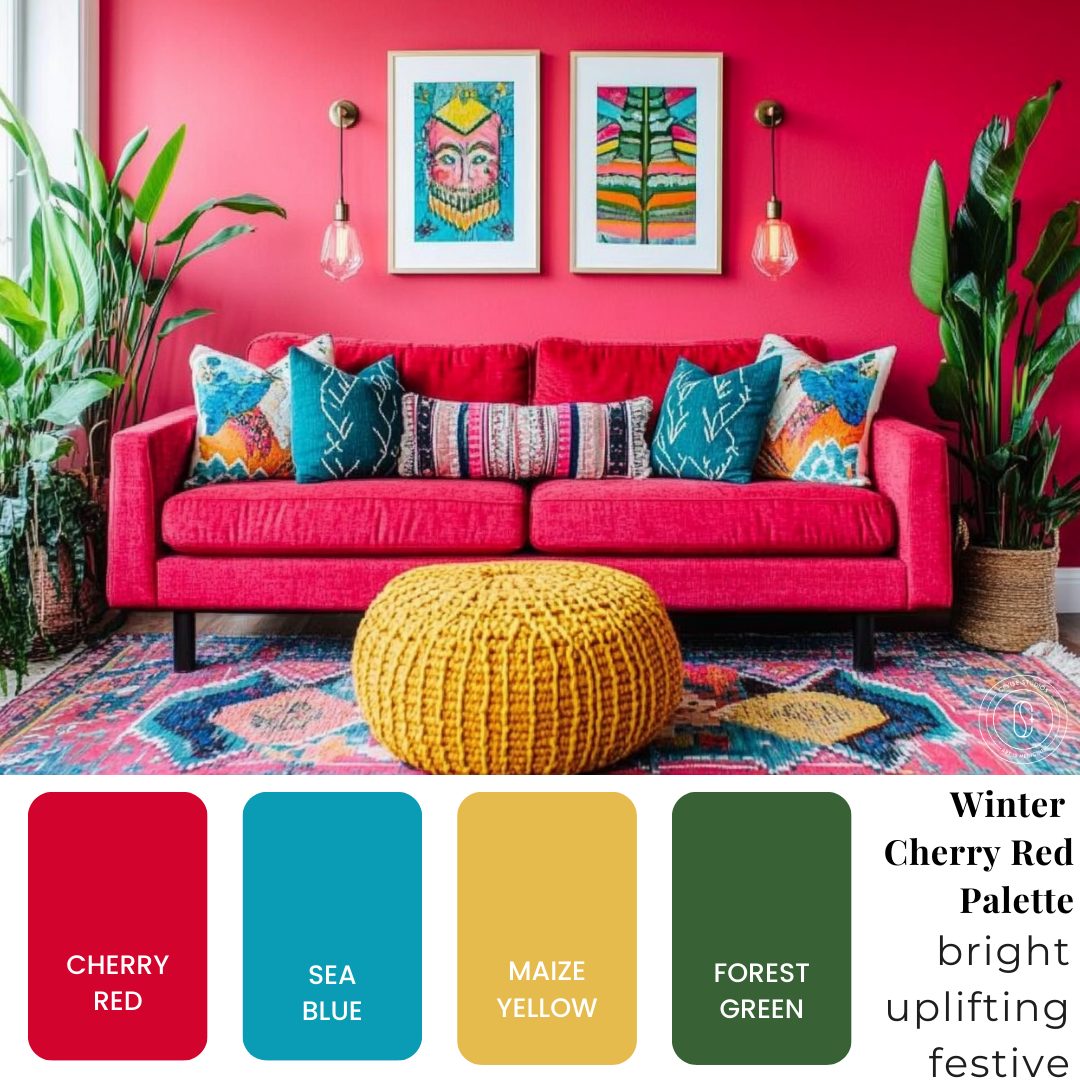
Cherry Red – The Fun & Festive Energy Boost
- Best for: Playful spaces, eclectic decor, social rooms
- Pairs well with: Sea blue, maize yellow, forest green
- Mood: Uplifting, festive, youthful
Cherry Red is vibrant and full of personality, making it perfect for spaces that thrive on energy and playful expression. It works beautifully in colorful living rooms, eclectic interiors, or creative studios where brightness and movement are encouraged.
Design Tip: Pair Cherry Red with Sea Blue and Maize Yellow for a high-contrast, dynamic look, or use Forest Green for a bold, holiday-inspired color palette.
B-Tier: Elegant & Classic Reds
Burgundy – The Sophisticated & Timeless Red
- Best for: Luxury interiors, formal spaces, classic decor
- Pairs well with: Steel blue, gold, mauve
- Mood: Elegant, refined, legacy-driven
Burgundy is rich, deep, and full of character, making it an excellent choice for sophisticated interiors. This red leans into classic refinement, making it ideal for offices, formal dining rooms, or vintage-inspired spaces.
Design Tip: Pair Burgundy with gold for a regal aesthetic, steel blue for a balanced contrast, or mauve for a soft, romantic feel.
C-Tier: Cozy & Grounding Reds
Brick Red – The Earthy & Warm Red
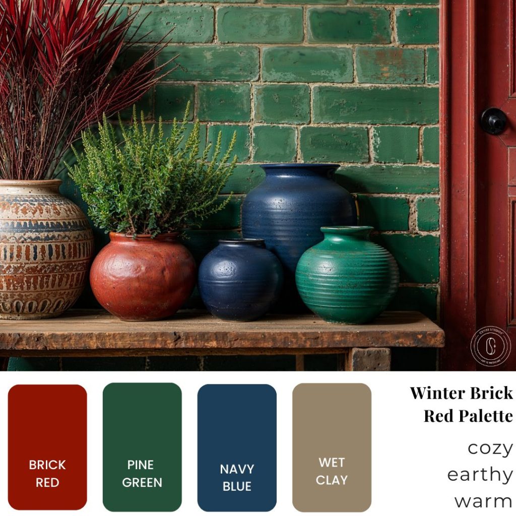
Brick Red is the most grounded red on this list, evoking a sense of earthiness and warmth. It works beautifully in farmhouse, bohemian, and natural-inspired interiors, where its muted tone can create a sense of cozy stability. While it doesn’t have the high-energy punch of Scarlet or Cherry Red, it excels in creating a relaxed and inviting ambiance.
Design Tip: Pair Brick Red with Pine Green for a natural, organic aesthetic, Navy Blue for depth, or Wet Clay for a warm, alternative triadic color story.
You May Like: The Power of Red: How This Bold Color Can Transform Your Emotional Wellbeing
How to Choose the Right Red for Your Space
When selecting a shade of red for your interior, consider:
1. Your Mood Goals
Do you want a color that energizes (Scarlet, Cherry) or one that grounds and stabilizes (Burgundy, Brick Red)?
2. Your Interior Style
Modern interiors benefit from bold reds, while rustic or vintage styles pair well with deeper, muted reds.
3. Your Existing Color Palette
Consider how red will interact with your current furniture, flooring, and decor to create harmony rather than clashing.
Bringing Winter Reds Into Your Home: Practical Design Tips
- Use red as an accent color. If you’re hesitant about committing to a red wall, start with pillows, rugs, or wall art to introduce warmth without overwhelming the space.
- Pair red with grounding tones. Reds balance beautifully with earthy greens, deep blues, and warm golds, creating a sophisticated and cohesive look.
- Consider lighting effects. Reds appear richer and more inviting in warm lighting, so experiment with ambient sources like table lamps, pendant lights, or candles.
- Incorporate texture. Different textures alter how red is perceived—for example, velvet enhances luxury, while matte finishes feel more understated and contemporary.
Which Winter Red is Right for You?
Do you gravitate toward the bold energy of Scarlet, the festive pop of Cherry, the timeless elegance of Burgundy, or the cozy warmth of Brick Red?
Let us know your favorite in the comments!
Need Expert Color Guidance?
✔ Take our Color Quiz to find the perfect shade for your space. Take Quiz Now!
✔ Book a Consultation with Ceyise Studios for personalized design advice tailored to your style and energy.
Final Thoughts
Red is one of the most emotionally powerful colors in interior design, making it an excellent choice for adding warmth, passion, and personality to your home. By understanding which red best aligns with your mood, style, and space, you can create an environment that feels both intentional and inspiring.
Ready to transform your space with the perfect winter red? Let’s create a design that reflects your personality and energy.