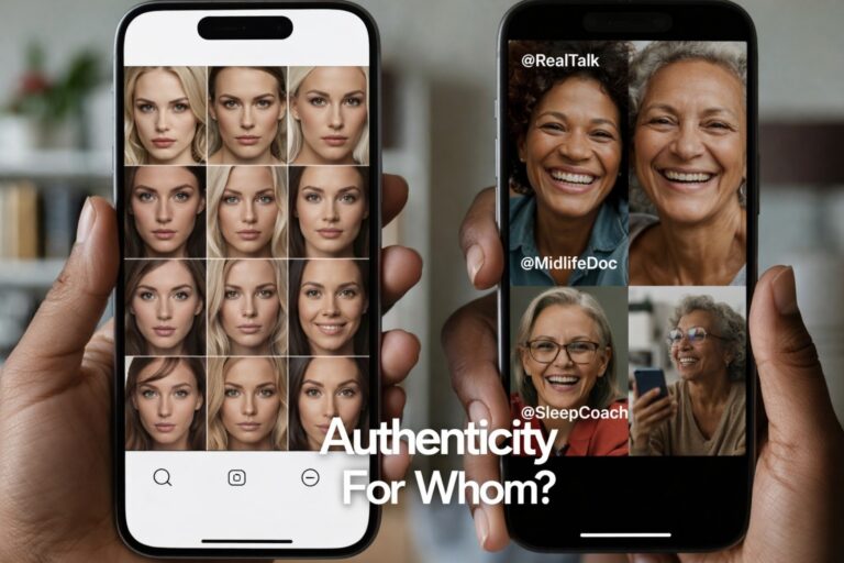
Black and White Photography creates drama and evokes strong emotions in viewers. While many renowned photographers use this contrast to capture striking images, Black and White Photos in Wellness Centers may not be suitable due to their potentially somber and intense focus, which can affect emotional well-being.
Colors Have Significance

If you’ve read any of my articles, you’re aware of the powerful influence of color. Colors influence not only how we perceive things, but also how we feel. Because colors have such a strong influence on how we think, feel, and act, interior designers must carefully consider and plan out color schemes. When people are already feeling stressed or fragile, these color schemes are even more important in wellness centers.
Here are three big reasons why you shouldn’t use black-and-white photos in your health center.
1. Black and White images can be somber

People frequently experience seasonal depression in the winter for a variety of reasons. People are more likely to stay inside, inactive, and in the dark when the air is cold and the sky is foggy. Despite the beauty of a snowy day, the lack of bright colors causes our spirits to sink and our happiness to dwindle.
When we look at Black and White photos, we think of a world without color or happiness. This is especially true for landscape photos that have a dark tone or a sense of dread. Fear, depression, or anxiety will be exacerbated in someone who is already suffering from these emotions.
2. Black and white photography can be considered eccentric

You May Like: Get in Touch with Your Inner Hue: The Ayurvedic Approach to Color Therapy
We’re accustomed to seeing color. It’s everywhere in the world. If we didn’t have it, our lives would be sad and boring. Even though Black and White photography has its place, it gives a false picture of the world. There’s a good reason why life doesn’t come in shades of gray. Colors, as previously stated, have significance. Certain colors can have a positive and rejuvenating effect on patients.
For example, the color green is popular in the healthcare field because it is associated with nature, freshness, and rebirth. Yellow makes people happy and creative, and blue makes them feel inspired and free.
3. Black and white photos can be intense

People see the contrast between highlights and shadows as serious, thought provoking, and dramatic. Monochromatic photographs emphasize a subject and sharpen details and textures. A Black and White photograph begs to be examined. People who take the time to look at it often find it pleasing to the eye.
However, the power of Black and White photography within a wellness facility can be overwhelming. These kinds of photos make people feel nostalgic and can take them back in time. An elderly person who misses her past may become overwhelmed by memories and regret.
Don’t Hold Back on Color

You May Like: Healthcare Colors Where Design, Art, and Medicine Intersect
Colors have a mysterious power, and when there aren’t any, people can feel sad, weird, or overwhelmed. People need colors, especially to heal, so it is a significant reason to avoid using black and white photos in wellness centers.
Withholding color from a sick person is like withholding powerful medicine for the mind. While monochrome photos and art have their place, a wellness center is better decorated with colorful scenery and healing colors.