February is a month synonymous with love, warmth, and the joy of meaningful connections. From Valentine’s Day celebrations to quiet moments of self-care, February encourages us to reflect on how we cultivate love and kindness in our relationships—and within ourselves. In the spirit of this month, let’s explore the transformative power of pink, a color that embodies warmth, compassion, and connection.

Why Pink? The Emotional Resonance of Warm Tones
Pink is often associated with love, but its emotional impact goes far beyond romantic gestures. Psychologically, pink tones have a calming effect, reducing aggression and fostering a sense of nurturing and care. While vibrant reds exude passion and intensity, pink offers a softer, more comforting energy that invites openness and emotional connection.

Studies in color psychology reveal that pink can:
- Encourage Empathy: Soft pink hues are known to promote feelings of kindness and understanding, making them ideal for spaces where connection thrives.
- Reduce Stress: Gentle pink tones can create a sense of tranquility, lowering tension and inviting relaxation.
- Foster Self-Love: The nurturing qualities of pink remind us to extend compassion inward, cultivating a sense of self-acceptance and care.
♒♓As we navigate the Aquarius and Pisces energy of February—a blend of innovative ideas and emotional depth—pink emerges as the perfect bridge between thought and feeling. It invites us to create spaces that support both connection and introspection.

Designing with Pink: Where Love and Connection Meet
Incorporating pink into your home doesn’t mean you need to commit to floor-to-ceiling blush tones. Thoughtful design choices can subtly weave the warmth of pink into your space, creating an atmosphere of love and connection without overwhelming your aesthetic. Here are some practical tips to bring pink’s transformative energy into your home:

You May Like: Colors That Are Most Calming
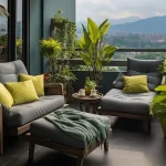
1. Soft Textures for Comfort and Warmth
Texture plays a crucial role in how colors are perceived. Pink tones paired with soft materials—like velvet, chenille, or faux fur—enhance their comforting effect. Consider adding:
- Blush-colored throw pillows on your couch or bed.
- A dusty pink velvet armchair that invites relaxation and conversation.
- A soft, rose-toned area rug to ground your space in warmth.
Tip: Layering textures not only adds visual interest but also enhances the tactile experience, making your home feel more inviting.
2. Lighting Matters: Amplify Pink’s Warmth
Lighting can dramatically influence how colors appear and impact mood. To maximize pink’s calming and nurturing qualities:
- Use warm, ambient lighting to soften the intensity of pink tones.
- Place blush-toned lampshades or votive candles in shared spaces to create a romantic glow.
- Consider smart bulbs with adjustable color settings to experiment with subtle pink light for a soothing atmosphere.

Design Intention: Combine soft textures and warm lighting to foster deeper emotional connections, whether you’re hosting guests or enjoying a quiet evening alone.
3. Accent Walls and Subtle Statements
For a bold yet balanced approach, consider incorporating pink into your home’s architecture:
- Paint an accent wall in a muted pink like dusty rose or peach blush to create a focal point without overwhelming the room.
- Use pink tile or wallpaper in small spaces like bathrooms or entryways to add charm and personality.
Color Pairing Tip: Pink pairs beautifully with neutral tones like beige and gray or contrasting colors like navy and emerald green for a sophisticated palette.
Integrating Artwork for Emotional Connection
Artwork can be a powerful way to introduce color into your home. ‘Inside Look,’ a limited-edition print by Dr. Stacey Denise from the Inner Reflection Collection, uses vibrant pink tones that harmonize beautifully with Sherwin-Williams’ Mellow Coral or Lotus Flower to create a balanced, emotionally uplifting atmosphere. This piece, featuring the intricate beauty of a Black-Eyed Susan, blends unexpected hues of pink with bold center details to create a visual sanctuary for meditation.

The abstract expressionist approach of Inside Look invites viewers to look beyond the surface, connecting with their inner emotions and promoting self-discovery. The soft pink tones evoke warmth and compassion, while the vivid greens and purples in the center symbolize growth and spiritual awakening. This artwork is a perfect addition to spaces designed for reflection, reminding us that beauty often lies in exploring what’s beneath the surface.
Tip for Incorporation: Hang Inside Look in a meditation corner or near soft lighting to amplify its calming and nurturing effects. Pair it with blush-colored accents for a cohesive and inviting space.

You May Like: Healthcare Colors Where Design, Art, and Medicine Intersect
4. Floral and Decorative Touches
Sometimes, the simplest additions make the biggest impact. Incorporate pink through:
- Fresh or dried flowers like peonies, roses, or eucalyptus with a pink tint.
- Artwork featuring pink tones to evoke love and warmth.
- Decorative ceramics, vases, or tableware in blush hues.

♒♓ Zodiac Note: Aquarius’ innovative energy pairs well with unconventional pink accents, while Pisces’ emotional depth thrives in spaces softened by floral and decorative touches.
Affirming Love and Connection in Your Space
As you design with pink, remember that the energy of your space reflects and reinforces your intentions. This month’s affirmation can guide your approach:
I nurture love, kindness, and compassion in my relationships and within myself.
Write this affirmation on a sticky note and place it near your pink accents as a daily reminder of your design’s purpose. By aligning your environment with your emotional goals, you create a space that doesn’t just look beautiful but also feels deeply meaningful.
The Role of Pink in Wellness Spaces
Pink’s impact isn’t limited to living rooms or bedrooms; it’s also an excellent choice for wellness-focused spaces like meditation corners or creative studios. Here’s how you can integrate pink into these areas:
- Use pink meditation cushions or yoga mats to evoke calm and focus.
- Add rose quartz crystals to your space for their loving, soothing energy.
- Incorporate pink-toned abstract art to inspire creativity and introspection.

Pink is more than just a color—it’s an energy that can transform spaces, moods, and personal expression. Our Pink Color Psychology Moodboard helps you explore different shades of pink and how to use them intentionally in your home, art, and wardrobe.
In Your Home: Use Alyssum SW-6589 for a calming bedroom, Rose Embroidery SW-6297 for a sophisticated living space, or Impatient Pink SW-6854 to add a bold statement through accent furniture or decor.
In Art: Infuse Feverish Pink SW-6859 for dynamic contrast, Bella Pink SW-6596 for a sense of peace, or Exuberant Pink SW-6840 to evoke energy and playfulness.


In Your Wardrobe: Wearing pink can influence your mood—Hibiscus SW-6851 is playful and fun, while Inner Child SW-6877 is soft and romantic. If you want to exude confidence, go for Eros Pink SW-6860 in accessories or statement pieces.

Want to experiment with these shades in your own space? You can explore Sherwin-Williams’ full range of pink hues here.
What’s Your Shade of Pink?
Pink isn’t one-size-fits-all. From pale blush to deep magenta, there’s a shade for every personality and purpose. As you experiment with pink in your home, think about:
- The emotions you want to evoke (e.g., calm, love, or creativity).
- The areas of your space that need an infusion of warmth and connection.
- How pink complements your existing color palette and design style.
Conclusion: Designing for Love and Connection
February is the perfect time to embrace the psychology of pink. By thoughtfully incorporating this color into your space through textures, lighting, and accents, you can create an environment that nurtures love, kindness, and compassion—both for others and yourself.
Ready to transform your space with the power of pink? Start small or go bold—the choice is yours. And remember, the love you infuse into your home will radiate back to you in countless ways. Let’s make February a celebration of connection and warmth, one beautiful shade of pink at a time.
Join Our Community and Explore More
If you’re ready to bring intentional design and art into your life, join the Ceyise Studios community! For personalized art and design services, or to explore the Quiet Meditation Series featuring Inside Look, visit Ceyise Studios. Let’s create something beautiful together.