Pantone has officially announced the color of the year for 2023, and it is opulent and lively! Viva Magenta 18-1750 is a vibrant red that is both powerful and empowering.
The name of Viva Magenta contains clues to its tone and meaning. The word “viva” comes from the Latin word “vivus” which means “alive” or “vibrant”.
Similarly, “magenta” refers to a specific shade of pinkish-purple, a color that is frequently linked with vitality, innovation, and aggressiveness!
Dr. Stacey Denise
According to Pantone, this warm color encourages self-expression and innovation. The color specialist thinks that Viva Magenta 18-1750 will capture the atmosphere of the year and inspire more people to define their freedom through creative expression.
Pantone draws influence from nature in the digital age. Viva-Magenta 18-1750 is a member of the red family and was inspired by red cochineal, one of the most valuable natural dyes.
This vibrant red can be found in the Netherlands’ tulip fields, the Greek Islands’ bougainvillaea, the northern lights above Iceland, and along Wisconsin’s Cranberry Highway.
Viva Magenta 18-1750 in Artwork:
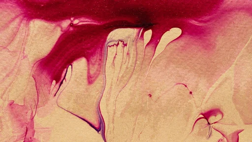
Viva Magenta is a vibrant color that works well in artwork to create an alien or surreal feeling. The vibrancy of the hue can help capture the viewer’s attention and create a sense of awe and excitement.
Viva Magenta can generate disjunction in artwork when paired with more muted or neutral hues, providing a sense of surreal or dreamy aspect within the piece that is visually interesting.
Viva Magenta Color Combinations for Decorating:

Are you looking for complementary colors to Pantone’s Viva Magenta 18-1750? This vivid crimson complements jewel tones such as emerald and navy blue.
If you don’t like jewel tones, try for a monochromatic look by combining 2023’s color of the year with other pinks and reds to create a clean look.
Dr. Stacey Denise
To create an eye-catching visual hierarchy with this deeper shade, we recommend using light tones.

Combining Viva Magenta with earthy tones is also a good decorative option. Soft natural hues such as sandy beige and browns will help to soften the intensity of Viva Magenta.
If you wish to embrace its aggressiveness, Viva Magenta also works nicely with neon, particularly bright yellow. Just make sure to anchor the color scheme with a soft, muted hue, such as beige.
Dr. Stacey Denise

What are your thoughts on Pantone’s 2023 color of the year? Whatever your thoughts are, one thing is certain: this playful red packs a big punch!
Use artwork and décor to channel its vitality into your own life. A dash of bright color in your home will instantly enliven it!